
How Can the Right Color Make Your Pants More Versatile?
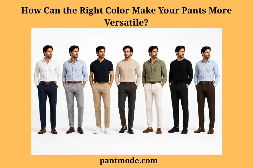
The right color maximizes pant versatility across your wardrobe by making trousers easier to coordinate with the tops, shoes, outerwear, seasons, and dress codes you actually use.
The best trouser color is not universal. Place color inside the broader pants-buying factors framework, then start with the wardrobe you already own and test saturation, lightness, undertone, fabric, occasion, footwear, outerwear, season, dress code, and the gap the new pair should fill.
No single pants color works for everyone. A color becomes versatile when it reduces outfit conflict and creates repeatable combinations in real life.
Quick Answer
The most versatile pants colors are usually muted neutrals and wardrobe anchor colors that coordinate with many tops, shoes, outerwear, and dress codes. Navy, charcoal, black, khaki, olive, brown, stone, and taupe can all be versatile, but the best choice depends on your existing wardrobe, footwear, climate, fabric, and lifestyle rather than one universal color rule.
Definition
Pant color versatility means a trouser color can be reused across many outfits because it coordinates easily with tops, shoes, belts, outerwear, seasons, and dress codes. A versatile pants color should reduce outfit conflict and increase repeatable combinations.
Key Takeaway
Choose versatile pants colors by checking three things before buying: whether the color works with at least three tops, whether it works with at least two shoes, and whether it fills a real wardrobe gap instead of duplicating a color role you already own.
Figure: a versatile trouser color earns wardrobe space by supporting real tops, footwear, layers, dress codes, and a clear wardrobe role.
Why Do Versatile Pants Colors Matter for Building a Useful Wardrobe?
Versatile pants colors matter for building a useful wardrobe because trouser color controls how easily tops, shoes, belts, outerwear, seasons, and dress codes combine into repeatable outfits.
Trousers occupy a large visible area in many outfits. Their color becomes an anchor for tops, footwear, jackets, coats, and accessories, even though pants do not determine the whole outfit by themselves.
Muted or neutral trousers usually introduce fewer pairing restrictions than highly saturated statement shades. Navy can support white, blue, grey, cream, brown, burgundy, and many muted colors, while vivid red trousers usually require more deliberate coordination.
Versatility depends on the wearer’s actual wardrobe. Olive can be highly useful in a closet built around cream, navy, brown, black, and denim, while charcoal may create more value in a business-oriented wardrobe.
Color must be evaluated with fabric and formality. Light beige linen can read relaxed and warm-weather focused, while beige wool can support a more structured smart-casual direction. The same color family changes when pants fabric changes.
Source boundary: the Montana State University Extension buymanship guide supports broad wardrobe planning and gives black, brown, navy, and khaki as examples of basic neutral colors that can support mixing and matching. Those examples are not mandatory colors for every wardrobe.
Pant Color Versatility Principles Table
| Variable | Why It Matters | Versatility Signal |
|---|---|---|
| Saturation | Strong colors demand more deliberate pairing | Muted colors are often easier to combine |
| Lightness | Changes contrast with tops and shoes | Mid and dark neutrals often span more settings |
| Undertone | Affects warm or cool coordination | Controlled undertones simplify matching |
| Fabric | Changes formality and seasonality | Same color can behave differently by material |
| Dress code | Determines acceptable color range | Darker refined colors often suit formal settings |
| Existing wardrobe | Determines real outfit potential | Best color works with pieces already owned |
| Climate / season | Influences fabric and visual weight | Color and fabric should be considered together |
What Makes Versatile Pants Colors Easy to Reuse in Everyday Styling?
Versatile pants colors are easy to reuse in everyday styling when they have controlled saturation, useful lightness, manageable undertone, and strong compatibility with the wearer’s wardrobe anchors.
Moderate or low saturation often reduces competition. Muted olive generally asks less of shirts, knitwear, jackets, and shoes than neon green, so it can function more easily as a wardrobe foundation.
Lightness changes contrast and formality. Mid-tone and dark neutrals often move across more settings, while lighter neutrals can broaden daytime and warm-weather outfits.
Undertone changes the actual pairing. A muted green-brown khaki can behave differently from a strongly yellow khaki, even if both products use the same color name.
The New Mexico State University color guide defines hue as the color family, value as lightness or darkness, and intensity as brightness or dullness. It also identifies black, white, and grey as achromatic neutrals. These concepts are used here only as practical color vocabulary, not trouser-color rankings.
Practical chromatic neutrals are an editorial styling category. Navy, olive, brown, khaki, taupe, and stone can behave like wardrobe anchors when they are muted and compatible with the wearer’s clothes, but they are not universal requirements.
Figure: saturation, lightness, and undertone explain why two trousers with the same color name can coordinate differently.
Core Neutral Comparison Table
| Neutral Category | Example Trouser Colors | Best Wardrobe Role | Main Watch-Out |
|---|---|---|---|
| Dark achromatic | Black, charcoal | Minimalist, evening, professional | Can become flat without texture or contrast |
| Light achromatic | White, light grey | Warm-weather, clean casual, statement neutral | Shows wear and stains more easily |
| Dark chromatic neutral | Navy | Dark anchor across casual and polished outfits | Very dark navy needs contrast beside black |
| Warm light neutral | Khaki, beige, stone | Daytime, chinos, warm-weather outfits | Undertones vary strongly |
| Muted green neutral | Olive | Casual, utility, transitional wardrobes | Can become overly military if repeated too much |
| Warm dark neutral | Brown | Heritage, seasonal, textured outfits | Needs intentional warm/cool coordination |
| Soft mixed neutral | Taupe, mushroom, stone-grey | Minimalist, soft casual, smart casual | May need contrast to avoid looking washed out |
Which Versatile Pants Colors Offer the Broadest Wardrobe Use?
The versatile pants colors that offer the broadest wardrobe use are the colors that match the wearer’s dress codes, climate, footwear, outerwear, existing tops, and preferred level of contrast.
Navy can serve as a dark anchor across casual, office, travel, and refined outfits; very dark navy may need texture or value separation beside black.
Charcoal can provide professional adaptability, though it can feel visually heavy in some warm-weather casual outfits.
Khaki and beige can create a lighter casual foundation, but their undertones vary enough that the actual shade should be checked.
Olive can act as a muted chromatic neutral; repeated utility cues across an entire outfit can become too thematic if that is not the intention.
Black can support minimalist, urban, evening, and formal directions, while low-contrast combinations with very dark shades need deliberate texture or value separation.
Brown can support heritage and seasonal wardrobes, and stone or taupe can broaden soft neutral wardrobes while usually feeling less formal than darker refined colors.
A foundation color should also support the wearer’s preferred pant style; minimalist, classic, utility, and expressive wardrobes may prioritize different anchors.
Color Versatility Decision Matrix
| Pant Color | Formality Range | Strong Seasons | Easy Top Directions | Main Strength |
|---|---|---|---|---|
| Navy | Casual to formal | Year-round | White, blue, grey, cream, burgundy | Dark versatility |
| Charcoal | Smart casual to formal | Year-round, cool seasons | White, blue, black, muted colors | Professional adaptability |
| Khaki / Beige | Casual to smart casual | Spring, summer, mild climates | Navy, white, blue, olive, brown | Light neutral utility |
| Olive | Casual to smart casual | Spring, fall, year-round | White, cream, navy, grey, black | Muted depth |
| Black | Casual to formal | Year-round | White, grey, blue, muted tones | Minimalist foundation |
| Brown | Casual to smart casual | Fall, winter | Cream, white, blue, olive, navy | Warm neutral |
| Stone / Taupe | Casual to smart casual | Spring, summer | Navy, white, olive, brown, pale blue | Soft neutral |
How Do You Build Cohesive Outfits With Versatile Pants Colors?
You build cohesive outfits with versatile pants colors by choosing the trouser color for the occasion first, then balancing contrast, top color, footwear, outerwear, and accessories.
Step 1 — Start with occasion and formality. Dark refined colors often support professional or formal settings, while khaki, olive, stone, and lighter neutrals can support relaxed daytime use. The actual pant occasion should guide the color without creating a rigid rule.
Step 2 — Decide between contrast and tonal continuity. A lighter top with darker trousers is an easy contrast method, while nearby shades can work tonally when value or texture keeps the outfit intentional.
Step 3 — Add a compatible top color. White, cream, blue, grey, black, brown, and muted colors can work across many neutral trouser families, but actual undertone and saturation still matter.
Step 4 — Add footwear according to color and formality. Shoes do not need to match the trousers; they should support the overall contrast, material direction, and setting.
Step 5 — Coordinate leather accessories where useful. Formal outfits may benefit from closer coordination, while casual and smart-casual outfits can use similar, complementary, or intentionally contrasting belt and shoe colors.
Top-and-Trouser Color Pairing Matrix
| Trouser Color | Easy Light Tops | Easy Dark Tops | Useful Accent Directions |
|---|---|---|---|
| Navy | White, cream, pale blue | Charcoal, brown | Burgundy, rust, muted green |
| Charcoal | White, cream, pale blue | Black, navy | Burgundy, forest green |
| Khaki | White, cream, pale blue | Navy, dark brown | Olive, burgundy |
| Olive | White, cream, beige | Navy, black, charcoal | Rust, muted blue |
| Black | White, cream, grey | Navy, black | Burgundy, olive, muted color |
| Brown | Cream, white, pale blue | Navy, charcoal | Olive, rust |
| Stone | White, pale blue, cream | Navy, olive, brown | Muted burgundy |
Which Shoe Colors Work Best With Versatile Pants Colors?
Shoe colors work best with versatile pants colors when the footwear supports the trouser color, outfit contrast, material, and dress-code context rather than following a rigid matching rule.
Navy can work with black, brown, burgundy, and casual white sneakers. Charcoal works easily with black and burgundy, while brown can work when the contrast is intentional.
Khaki and olive accept several grounding directions, including brown, black, burgundy, and white sneakers depending on fabric and setting.
Black trousers do not require black shoes in every outfit. White sneakers can create a clear casual contrast, while brown or burgundy needs more intentional coordination.
Brown trousers can work with brown, burgundy, white sneakers, and selective black footwear. Stone and taupe can pair with brown, white sneakers, black, and burgundy.
Black and brown can coexist, and exact belt-to-shoe matching is optional outside stricter formal settings. The goal is a coherent total palette rather than mechanical matching.
Shoe & Trouser Matching Table
| Trouser Color | Black Shoes | Brown Shoes | Burgundy Shoes | White Sneakers |
|---|---|---|---|---|
| Navy | Strong | Strong | Strong | Strong casual |
| Charcoal | Strong | Works when intentionally coordinated | Strong | Good casual |
| Khaki | Good | Strong | Good | Strong casual |
| Olive | Good | Strong | Strong | Strong casual |
| Black | Strong | Intentional contrast | Limited / context-dependent | Strong casual |
| Brown | Limited / context-dependent | Strong | Good | Good casual |
| Stone / Taupe | Good | Strong | Good | Strong casual |
What Color Styling Mistakes Reduce Versatile Pants Colors?
Color styling mistakes reduce versatile pants colors when saturation, undertone, value contrast, fabric seasonality, accessories, or existing wardrobe colors make the trousers harder to reuse.
Black, navy, and charcoal can blend accidentally. Increase separation through texture, lightness, or a clearly intentional tonal palette.
Highly saturated trousers can dominate every outfit. Statement pants are valid when they fit personal style, but a first foundation color usually benefits from broader pairing range.
Khaki clashes often come from undertone. Compare the actual yellow, green, brown, or grey bias against the tops and outerwear you own.
Seasonal disconnection can come from fabric rather than color. Beige linen and beige wool communicate different visual weight, so changing material or texture may solve the problem.
Shoes and belts can compete without needing an exact-match rule. Balance formality, material, and contrast instead of forcing identical leather colors.
Too many flat neutrals can feel visually inactive. Add texture, layering, controlled accent color, or a subtle pants pattern rather than assuming the neutral itself is wrong.
Color Styling Mistake/Fix Matrix
| Problem | Likely Cause | Better Fix |
|---|---|---|
| Black and navy look accidental | Too little value separation | Add contrast or texture |
| Statement pants are hard to reuse | High saturation dominates outfits | Build neutral foundation first |
| Khaki pairing looks wrong | Undertone mismatch | Compare actual shade |
| Winter outfit looks too light | Fabric-season mismatch | Change fabric weight, not necessarily color |
| Shoes feel disconnected | Palette or formality conflict | Coordinate overall outfit |
| Too many neutrals feel flat | No texture or contrast | Add texture, layer, or accent |
| Neutral pants still feel unusable | Wardrobe colors do not support them | Audit existing tops and shoes |
How Can You Audit Your Closet for More Versatile Pants Colors?
You can audit your closet for more versatile pants colors by grouping trousers by color family, counting real outfit pairings, identifying dress-code gaps, and choosing the next color from wardrobe evidence.
Step 1 — Group trousers by color family. Separate dark neutrals, light neutrals, muted chromatic neutrals, and statement colors.
Step 2 — Count actual outfit compatibility. Test each trouser with at least three frequently worn tops and multiple useful shoes. This is a practical wardrobe heuristic rather than a scientific threshold.
Step 3 — Identify dress-code gaps. Ask whether the wardrobe has a dark professional option, a casual neutral, and a lighter warm-weather option where the wearer’s life actually needs them.
Step 4 — Identify duplication. Multiple nearly identical pants can add less value than one missing color family, unless the duplicate solves a different fabric, season, fit, or formality role.
Step 5 — Choose from wardrobe evidence. Prefer the color that coordinates with the largest number of existing tops and shoes while filling the biggest real occasion or seasonal gap.
Wardrobe Foundation Audit Table
| Wardrobe Role | Example Colors | Already Covered? | Priority |
|---|---|---|---|
| Dark versatile anchor | Navy, charcoal, black | Low / Medium / High | |
| Light casual neutral | Khaki, beige, stone | Low / Medium / High | |
| Muted casual neutral | Olive, brown | Low / Medium / High | |
| Professional trouser | Charcoal, navy | Low / Medium / High | |
| Warm-weather option | Stone, beige, light khaki | Low / Medium / High | |
| Cool-season textured option | Brown, charcoal, olive | Low / Medium / High | |
| Statement color | Personal preference | Low / Medium / High |
Figure: F50 moves from wardrobe role through real pairings, color qualities, duplication, exceptions, and repeatability.
What F50 Checks Verify Versatile Pants Colors Before Buying?
F50 checks verify versatile pants colors before buying by turning wardrobe role, existing tops, footwear, dress code, saturation, undertone, duplication, exceptions, and outfit repeatability into a controlled decision path.
Trigger: identify whether the reader is buying a first foundation color, replacing an old pair, filling a wardrobe gap, or testing a statement color.
Classification: classify wardrobe role, existing tops, shoes, outerwear, formality, season, saturation, lightness, undertone, duplication, and repeatability.
Recommendation: match the need to a dark anchor, professional neutral, lighter casual neutral, muted casual neutral, or deliberate statement color.
Red flag: catch low compatibility, narrow footwear range, accidental dark blending, undertone mismatch, excessive saturation, fabric-season mismatch, unusable neutrals, and accessory conflict.
Exception: allow statement shades, black-and-brown contrast, black-and-navy tonal combinations, casual white sneakers, seasonal inversions, olive foundations, or duplicate colors when the role is clearly justified.
Verification: approve the color only after top, shoe, outerwear, dress-code, undertone, fabric, gap, and repeatability checks pass.
F50 Pant Color Decision-Control Table
| F50 Step | Control Question | Pass Standard |
|---|---|---|
| Trigger | Is the reader choosing or questioning a trouser color? | Color decision is clear |
| Classification | What wardrobe role, tops, shoes, dress code, season, saturation, lightness, and undertone apply? | Color need is classified before recommendation |
| Recommendation | Which color direction matches the classified need? | Color supports wardrobe role and outfit use |
| Red flag | Does the color fail because of low compatibility, undertone, saturation, contrast, season, or accessories? | Problem is named before correction |
| Exception | Is statement color, tonal darkness, mixed leather, or duplicate color intentional? | Exception is clearly justified |
| Verification | Does the color work with tops, shoes, outerwear, dress code, fabric, and real settings? | Color is approved only after checks pass |
| Source scope | Are NMSU and MSU Extension used only within evidence limits? | No source is stretched beyond scope |
| URL validation | Are all internal links from /pant-factors/ only? | No self-link, no /pant-types/, no invented URL |
What Final Checklist Helps You Choose Versatile Pants Colors?
A final checklist helps you choose versatile pants colors by testing whether the shade coordinates with your existing tops, shoes, outerwear, dress codes, seasons, accessories, and wardrobe gaps.
Check real compatibility, actual undertone, saturation, fabric, duplication, and wardrobe role. A statement shade can be valid, but it should still make sense in real outfits after the initial excitement fades.
Final Pant Color Versatility Checklist
| Check | Pass / Fail |
|---|---|
| Does this color coordinate with at least three tops I already wear regularly? | |
| Does it work with at least two useful shoe options? | |
| Does it fit the dress codes I encounter most often? | |
| Does the color complement the outerwear I already own? | |
| Is its saturation appropriate for the role I want it to play? | |
| Have I checked its actual undertone rather than relying only on the color name? | |
| Does the fabric make the color appropriate for the intended season? | |
| Does this color fill a real wardrobe gap? | |
| Am I duplicating a color family I already own heavily? | |
| Can I use the pants across more than one setting? | |
| Does the color work in both contrast and tonal outfits? | |
| Do my preferred accessories coordinate naturally with it? | |
| If it is a statement shade, have I already built the core neutral foundation I need? | |
| Would I still choose this color if it were not currently trending? | |
| Does this color genuinely suit my personal wardrobe rather than a generic must-have list? |
Final Wardrobe Color Gap Checklist
| Check | Pass / Fail |
|---|---|
| Do I have one dark anchor trouser color? | |
| Do I have one lighter casual neutral if my climate or lifestyle needs it? | |
| Do I have a professional trouser color if my work or formal life needs it? | |
| Do I have a muted casual neutral such as olive or brown if it fits my wardrobe? | |
| Do my trouser colors work with my most-used shoes? | |
| Do my trouser colors work with my most-used outerwear? | |
| Do I own too many pants in the same color family? | |
| Is my next purchase solving a real outfit problem? | |
| Is a statement color supported by enough simple tops and shoes? | |
| Is this color useful beyond one outfit idea? |
What Final Rule Should Guide Versatile Pants Colors?
The final rule for versatile pants colors is to choose the trouser shade that creates the most repeatable outfits with your existing wardrobe before following a generic must-have color list.
Judge the color by its wardrobe role, existing tops, useful shoes, outerwear, dress code, season, fabric, saturation, lightness, undertone, contrast, accessories, duplication, gap filling, and repeatability.
No single pants color works for every wardrobe, and color versatility is proven by real combinations rather than by a color name alone.
The most versatile pants color is the one that works with the clothes you already wear, fills a real wardrobe gap, and makes more outfits easier instead of more complicated.